
Ander Studio:Making internal tools usable again
I’m redesigning Ander Studio to stop our internal designers from 'fighting' with the tool and help them get back to building great content for clients like Hyundai.
Timeline
12 Weeks Group Project
My Role
UX/UI Design, Interaction Design
Deliverables
Persona, UX Research, Experience Maps, User Flow, UX Wireframe, Interactive Prototype, Visual Design and Usability Testing
Why I’m here
This is my Capstone project at the University of Toronto (iSchool). I’m collaborating with Ander, an EdTech startup that builds employee training systems for major companies like Hyundai.
The Conflict: “Our own team stopped using it!!”
At the heart of Ander’s operations is Ander Studio—an internal platform designed for our content designers to build micro-learning modules.
The problem? Our own team is losing faith in it.
According to recent feedback, engagement is dropping. In plain English: the tool has become so frustrating and clunky to use that designers are finding ways to avoid it. This isn't just a UI issue; it’s a productivity bottleneck that slows down how fast we deliver work to clients like Hyundai.
My Mission: Stop the friction
My job isn't to just "make it look pretty." I'm acting as an internal detective to figure out why the engagement is dropping . I need to pinpoint the "keyboard-smashing" moments in the workflow and design a future MVP that helps our content designers get their work done with confidence and zero friction.
UX Research
User Interviews
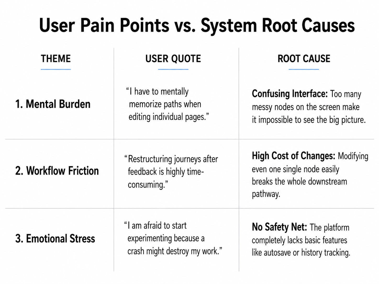
To pinpoint the root causes of declining engagement, I conducted qualitative research through deep-dive interviews with 6 internal participants. I prioritized qualitative insights over quantitative data because I needed to understand the "emotional friction"—the specific moments where designers felt so frustrated that they abandoned Ander Studio for external workarounds.
Why we did it:
Startup Context: Ander is a growing startup, and the internal platform (Ander Studio) has a small, highly specific group of users. Sending out a mass quantitative survey wouldn't make sense for this small user base.
Finding the "Root Cause": We needed to understand why creators felt frustrated and "afraid to start". A cold percentage number from a survey couldn't show us their emotional stress. By talking to them directly, we uncovered their real habits—like how they relied on memory to track paths and why they felt forced to use external tools.
Interviews allowed me to map out the current internal workflow and identify where the system failed to meet professional design standards. To ensure a comprehensive view, the respondents were selected based on the following internal roles/criteria:
Content Designers who use the platform daily to build modules for clients like Hyundai.
Operations Managers who oversee the end-to-end course delivery process.
Learning Content Creators who focus on the pedagogical logic and quiz structures.
Why we mapped this:
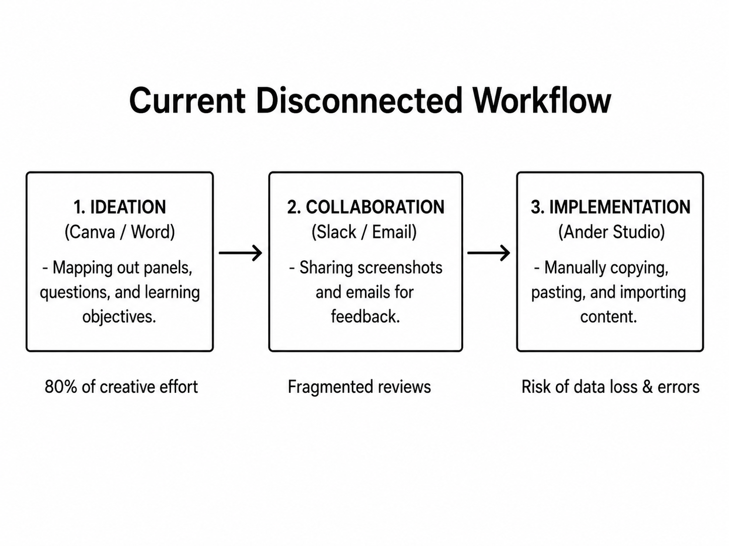
Our interviews proved that creators weren't struggling with creativity, but with system implementation
They were forced to use external tools because the internal platform felt like a technical wall rather than a safe creative space. Our goal is to bridge this gap.
Ideation & Product Strategy
The Strategy: Setting Our Core Design Pillars
Before drawing any screens, our team used the interview insights to set three simple design pillars. Every feature we designed had to follow these rules:
Centralize the Workflow: Bring brainstorming and execution into one single system so creators stop leaving for Canva.
Reduce Cognitive Load: Move from a chaotic "one question per node" view to an organized "section-based" model.
Build a Safety Net: Introduce reliable system safeguards so users never feel anxious about losing their progress.
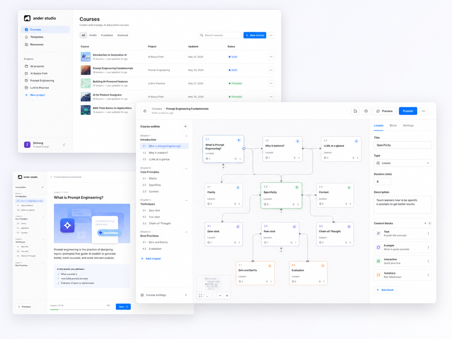
Driven by our interview insights, we knew we couldn't just fix a few buttons—we needed to completely rethink how the platform structured information. Before building any high-fidelity screens, we created a rough v0 concept sketch to test a new, aggregated layout and see if we could lower the users' mental burden.
What We Learned From This Early Attempt
This initial sketch validated that separating the layout into a macro canvas and a right-side editing panel helped reduce clutter. However, it also revealed a major flaw: we crammed too many features (text editing, media assets, and team comments) into that single right panel, making the interface feel overly bloated and distracting.
To solve this, we moved to the next phase: decoupling these features into focused modes and mapping out our core interactive solutions